Wednesday 19 September 2007 — This is over 18 years old. Be careful.
A recent thread on Django Users, Visual recognition of Django website is about the need for a favicon for the Django web site. The thread follows a typical path, starting with a reasonable request, followed by a smattering of debate about whether it is in fact a good idea. A few people posted proposed favicon files based on the d in the Django logo (including one with a Makefile!)
Making a good 16×16 pixel icon is tough. Here’s how I made one that avoids some of the smearing. I started with the Django logo, took the Dj (in honor of DJ Ango!) from it, and placed them in a square. The color is a very dark green that would look black at such small sizes, so I lightened it to a green borrowed from one of the Django badges:

If I simply scale this image down to 16×16, it looks like this:

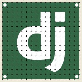
The letters here are blurred, and we can do better. To see why the letters are blurred, go back to the full-size square, and turn on the grid, setting it to one-sixteenth the width of the square. The grid now represents the 16×16 pixels of the final actual-size icon:

Most of the edges of the letters don’t fall neatly onto the pixels defined by the grid. As a result, when the image is scaled down, the edges are blurred. To prevent this, we have to move the letters’ edges so that they line up better with the grid. This is what font renderers do for you, and a great deal of work has gone into type hinting that can automatically adjust the curves of letters to align with whatever pixel grid they are being rendered onto.
To improve the icon, I did this by hand. Using the grid as a guide, I used the lasso tool to select parts of letters and move them until they fit better onto the grid:

This changed all sorts of details of the letters, including the height, the thickness of the stems, and so on, but kept the overall feel of the logo. (here it is if you want it.) Generally, I haven’t worried too much about the curvy parts: remember we’re going to be scaling down to 16×16 at the end anyway, so all the mistakes will be fuzzed away. I added the white dots in the corner pixels to get a slight rounded look to the corners when they get rendered down. The final icon:

The two favicons side-by-side, old and new:


Is it better? I think so.
Comments
@Mikey: you are right, my attempt at rounded corners doesn't quite work.
Paul
I 'd like to play a little bit with the colors so we can make an icon for the greek Django website! Could you upload the second picture?
Thanks :)
Looks nice!
Add a comment: