Saturday 22 December 2012 — This is more than 13 years old. Be careful.
Warning: what follows is me reminiscing about stuff I found in a box in my attic (not really, metaphorically). You don’t have to read it. I enjoyed going through it!
Almost 20 years ago, when I worked at Lotus, I wrote a tool called NotesPeek, for peering into Notes databases. It ran on Windows, and was modelled on the then-new Windows Explorer: a tree control on the left, and a pane on the right for details. More description and screenshots are at the DeveloperWorks page about NotesPeek.
One of the appealing aspects of writing NotesPeek was making the pixel art. The tree control had a different icon for each different kind of thing in the tree. Notes databases consisted of many different kinds of records, and each one got its own icon. I had to design (or steal) each of them.
NotesPeek ran on Windows, and at the time, 16-color displays were typical, so most artwork used the Windows 16-color palette as a lowest common denominator. This meant using hand-dithering to get interesting effects. Light and dark pixels would have to suggest features that couldn’t be actually drawn in such tight spaces.
Showing these icons now is a tricky matter, because pixels are much smaller than they were then, and LCD screens are crisper than the CRTs then. To see them as they were then, try magnifying your browser window a bit, which will give you both larger pixels and a bit of smearing.
The Notes icon then was three “bowling pin” people on a yellow plinth, and the NotesPeek icon was a riff on that: an x-ray machine showing the insides of the people:


The x-ray screen worked really well, and I liked the subtle tie-in of the skeletons with the tree control at the core of the UI. The bowling-pin person would show up in a few of my icons to represent “Notes.”
The tree-control icons were smaller, only 16×16 pixels, which meant there weren’t many pixels to play with. It was fun to try to come up with a graphical representation of a concept, and then to try to make it look good with only 16×16 pixels and 16 colors. I didn’t always succeed, and luckily this was just a free side-project developer’s tool, so if the icons were clunky, tough luck. But a few of them I liked.


Here the last two icons in the top row are a database, and a template for a database. The last icon in the second row represented “blob,” and has some nice shading effects. In icons with overlapping objects, there’s a gray pixel in the black outline to keep them from merging together.


These represent the various access levels. I lifted them from the product itself, so they look better than most. I drew the drama mask at the end to represent “Role.”


Various kinds of documents. Notice the second-to-last icon has a bowling-pin guy rendered only 3 pixels wide.

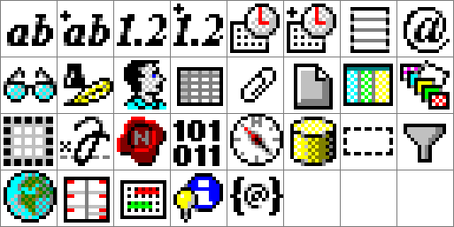
These are types of fields. The second and third icons in the third row please me still: Signature and Seal, and the next one, Binary, I also like.
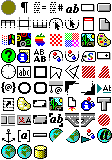

About now is when the icons start getting out of hand. Rich text in a Notes database is stored as Compound Document Records, and there are many kinds of CD Record, each with their own icon. In this menagerie you can find OS icons (Windows, OS/2, and Mac), a palette, a red-to-blue link used in a few ways and plenty of other stuff, I didn’t even know at the time what they all meant.



Forbidden documents? Random stuff.


Some developer things, including two different representations of “Java.”


Another burst of CD Record icons, including international things, frameset pieces, a color wheel, and another blobby thing.


The last few miscellaneous icons. Whew!
There’s one last bit of art in NotesPeek, an icon of my face for the easter egg:

I didn’t draw this, I made it from a photo, of course. I include it only because I am amazed at how little it looks like my, or any other, face when magnified:

There are no features on there! But when viewed actual size, I am clearly recognizable. Pixel art indeed. Spooky.
Comments
1. The stub only shows some timestamps. Is there any other header data available in the stub (Sender, Recipient, Subject?) and if so, can it be displayed?
2. Add a way to dump the information displayed to a csv? (I have over 30,000 stubs and am looking for some specific ones.)
Thanks,
Richard
I did a bit of research and found a post on Ytria's site that describes the contents of a deletion stub. No header data is saved so ignore my first enhancement request. That said, the ability to dump the data displayed in NotesPeek to a CSV would still be very useful (and not just for deletion stubs).
Thanks,
Richard
Add a comment: