Saturday 2 April 2016 — This is over nine years old. Be careful.
If you use Slack, or read docs on Read The Docs, you’ve seen Lato. It’s a free high-quality font. I like it a lot, but it has a feature that bugs me a lot: the f-i ligature:

If you’ve never looked into this before, a ligature is a combination of letters that are designed as a new distinct glyph. In this case, there’s an “fi” shape that is used when you have an “f” and an “i” next to each other.
Ligatures have a long tradition in Latin fonts, for a reason: some pairings of letters can have a jarring look. The bulb of the f and the dot of the i can clash, and it looks better to design a combined shape that shares the space better.
But Lato doesn’t suffer from this problem. Ligatures are a solution to a problem, and here they are being used when there is no problem to solve. The Lato fi ligature is more jarring than the f and the i, because it looks like there’s no dot for the i.
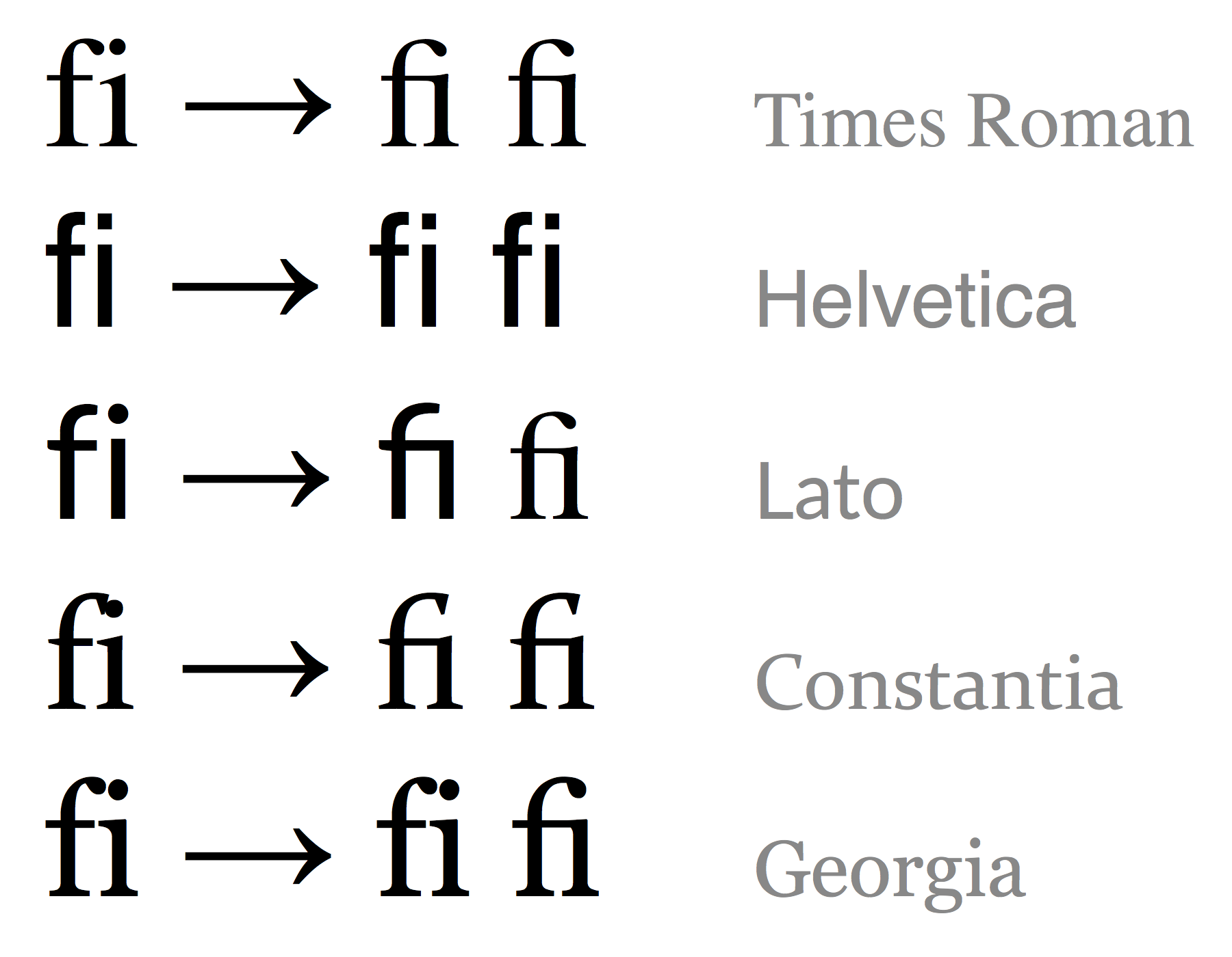
Here’s a comparison of the fi ligature in some fonts. The first column is a plain f and i presented naturally, but forced to be individual, naively. Then the fi combination as the browser text renderer draws them, and then the Unicode fi ligature, U+FB01 (LATIN SMALL LIGATURE FI):

The naive Lato f and i look fine together without any intervention. The ligature looks silly without the dot. The f is trying to reach over to join the dot, but it’s too far to reach, so it doesn’t get there, and the f has no bulb in the first place. It doesn’t make any sense.
Constantia and Georgia demonstrate a good use of ligatures: the naive pairing shows how the bulb and the dot crowd into each other, and the ligatures shift things a little to resolve the clash.
(Somehow, Lato doesn’t map its fi ligature to the U+FB01 code point, so we get the default font there instead.) If you want to experiment, here’s the HTML file I used to make the image.
By the way, it was an interesting challenge to get the browsers to display the unligatured f-i pairs. In Firefox, I used a zero-width space (U+200B) between the characters. But Chrome substituted the ligature anyway, so I tried putting the f and the i in adjacent spans. This worked in Chrome, but Firefox used the ligature. So I combined both methods:
<span>f​</span><span>i</span>
Comments
You can disable ligatures in Chrome with this css:and you could add it to the Stylebot chrome extension for readthedocs.org. I actually have a global rule to add ligatures for all sites but I agree the the Lato one isn't nice.
For all browsers:
.class {
  font-variant-ligatures: no-common-ligatures;
  -moz-font-feature-settings: "liga" 0, "clig" 0;
  -webkit-font-feature-settings: "liga" 0, "clig" 0;
  font-feature-settings: "liga" 0, "clig" 0;
}
taken from https://helpx.adobe.com/typekit/using/open-type-syntax.html#liga@sr: the ffi ligature is another distinct ligature (Unicode U+FB03), so it's probably been designed like that. Another misstep... :(
References:
http://www.latofonts.com/2014/02/27/lato-2-0-released/
http://www.jsdelivr.com/projects/font-lato
https://github.com/google/fonts/issues/6
"its using lato regular"
*googles lato regular ligatures*
"oh look i'm not the only one."
-- me, 5min ago.
Problem with font-variant-ligatures:none; it also removes good kerning in all the other leters.
Add a comment: