Sunday 3 March 2013 — This is almost 13 years old. Be careful.
I have long been interested in the technology of printing, especially typography. Two years ago, when I went to the Boston Printing Office auction, I met Keith Cross, a lecturer at MassArt. He teaches letterpress classes, usually spread over the course of a semester, which I wasn’t able to commit to. When he announced a one-day Saturday workshop, I jumped at it. It happened yesterday, and I loved it.
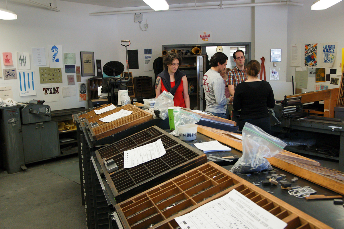
The workshop is hands-on: you start off standing at a type case, and with a few minutes of verbal instruction, you start putting type into a job stick:
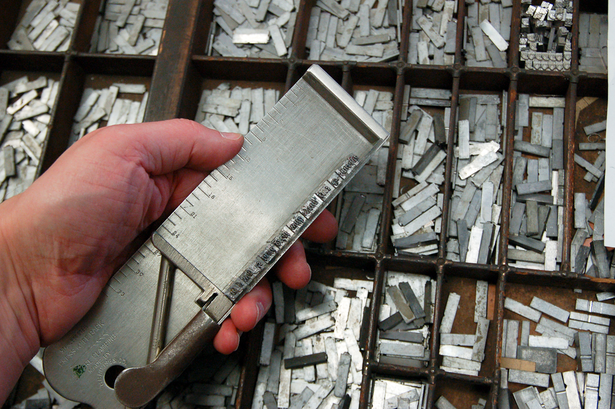
I was familiar with the concepts of cold metal type, job sticks, California cases, and so on, but had never had a chance to try it myself. I was really pleased to be able to work with these little pieces of metal, and set actual lines of type.
You don’t need to know the history of type to take the class. Keith explains what you need to know, and walks around gently guiding people to get them over rough spots.
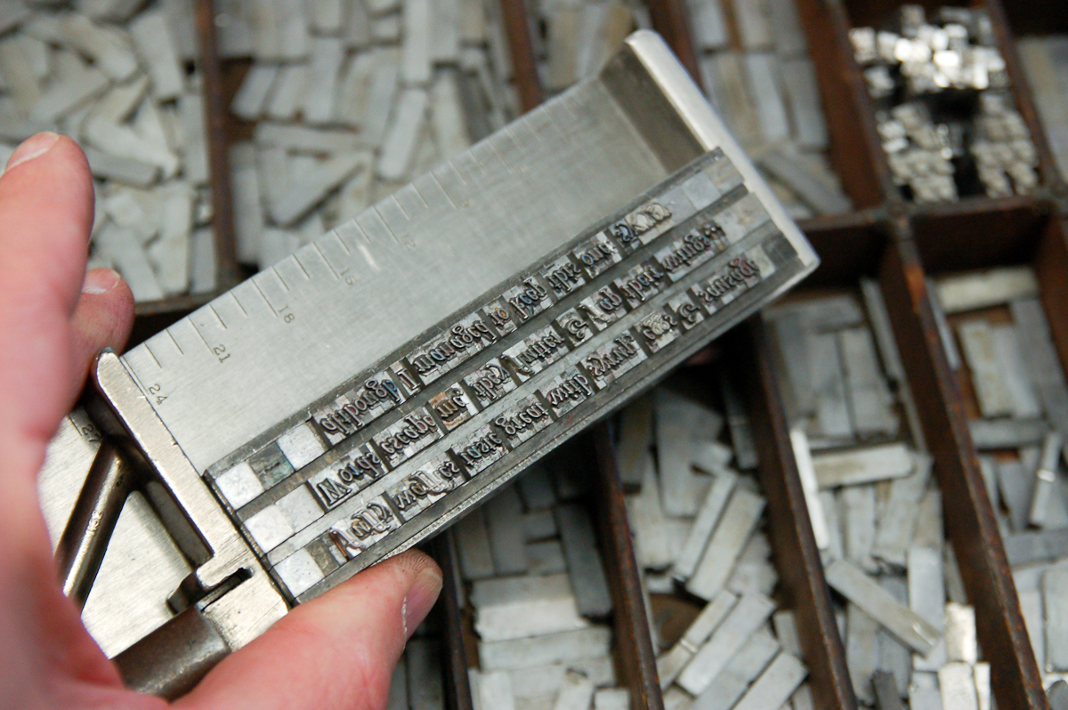
I was having fun, and so went a little overboard. I wanted to use the fancy ligatures, so I included words like “fluffy waffles,” and when I saw that my type case had a “gg” ligature, I had to add “eggs.” Then I discovered it had “zy” and “gy” ligatures, so I couldn’t stop until I got “syzygy” in there!
It says,
fluffy waffles taste great with syrup, eggs & sausage
Words escape me, they flutter & flap their wings...
although I managed to keep this one: syzygy
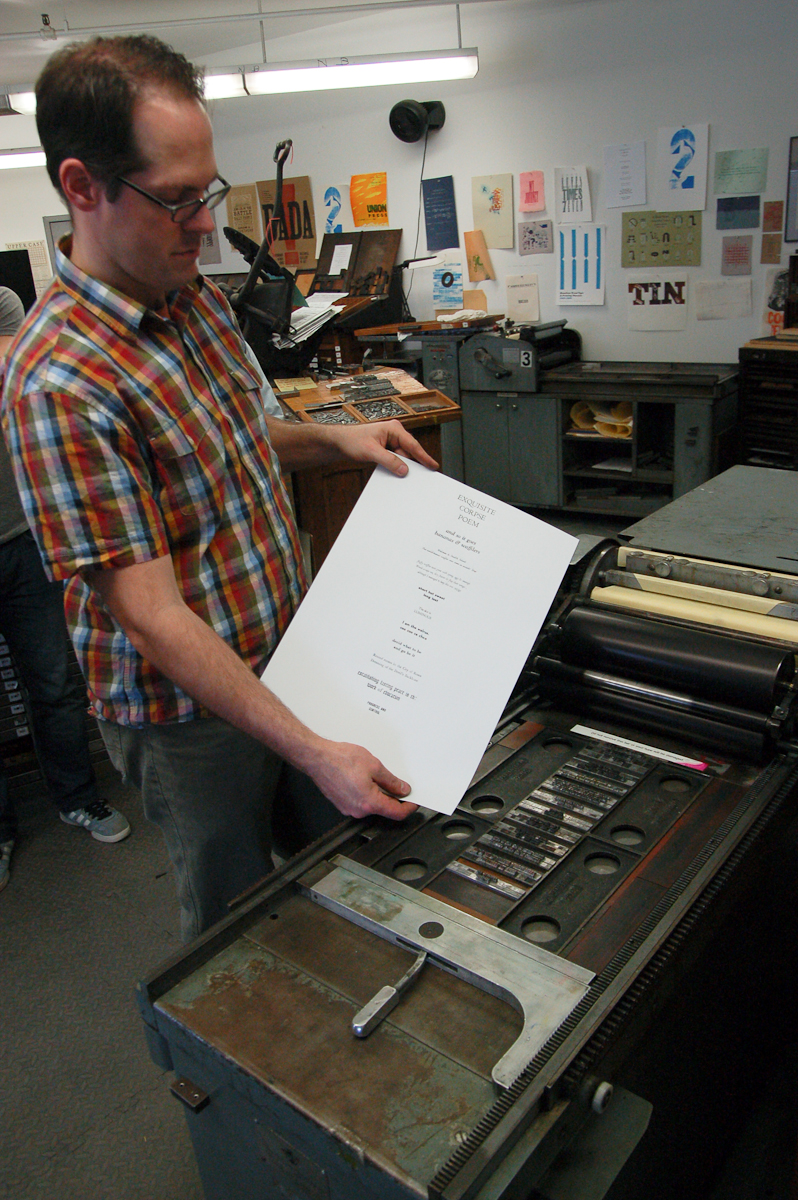
Each student produced a few lines of type, then we all headed over to the press to assemble them together into a page:
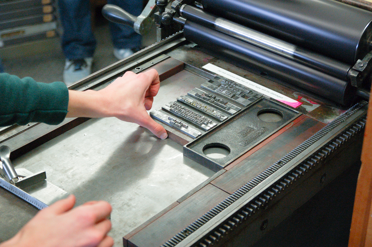
Once we had all contributed our lines, Keith added larger blocks of iron and wood, known as “furniture” around it to hold it all in place, and locked it in with quoins.

A little discussion of paper, the mechanics of the press, then Keith rolls the press, and there’s a printed sheet!
The first sheet is called a proof, because it’s used to check the typesetting. The next step is to read the proof, an activity known as “proofreading”! One of the things I find fascinating about type is how history bleeds through into the present in the terminology and conventions. “Leading” makes much more visceral sense when you are holding a 6-pt thick bar of lead alloy, and place it between your rows of type.
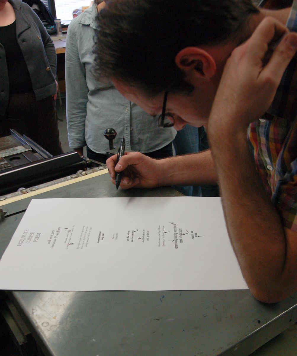
Mistakes were identified, as were worn pieces of type. The form in the press was unlocked, and corrections made, by pulling out bits of type with a tweezers, inserting new ones, adjusting spacing, and so on. Then we each printed a sheet of our own.
When the printing was done, and the type had been cleaned, we each retrieved our lines of type, and put each tiny piece back into the proper compartment. Thinking about how long it took to find the type, set the type, adjust the type, print the type, and then clean up and put away the type, I am amazed anew that books, newspapers, and even encyclopedias ever got printed. This was very labor-intensive, dirty work. A few hours in a letterpress shop, and it is clearly industry.
After lunch, we each worked on a project of our own. I chose a quote from E. B. White:
Creation is in part merely the business of forgoing the great and small distractions.
I liked it not only for what it says, but because the words “great” and “small” could be used for a little type expression.
Here’s where the old ways really seemed difficult! I wasn’t sure what layout to use, and ended up changing my mind half-way through. So I had to move rows of metal chunks from one line to the next, and hope not to drop the whole thing.
Each line has to be completely packed tight with metal so that when the type is on the press, it will all be held tightly in place. This means that you need to find just the right thickness to fill the gaps, perhaps even slivers of brass to finish a tiny space.
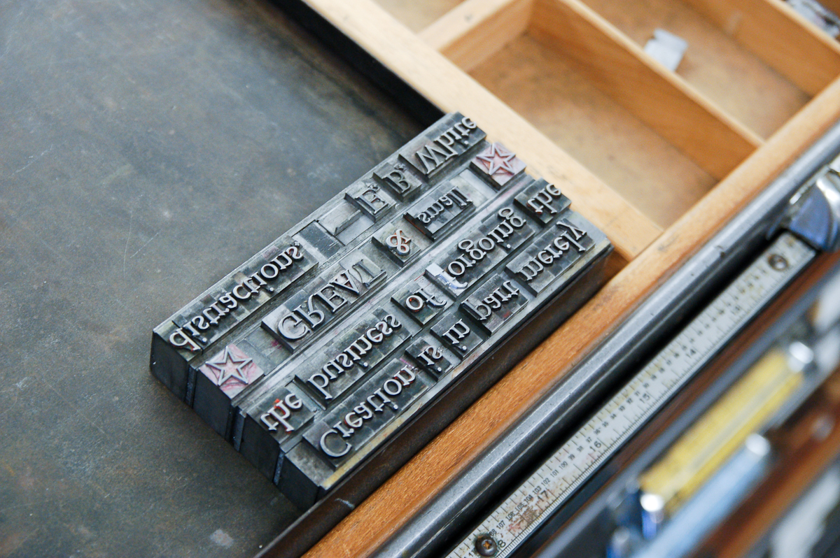
I wanted an em-dash, but there wasn’t one in my type case. We made one with a 36-pt piece of metal, spaced properly with yet more tiny chunks of metal. After dealing digitally with different kinds of spaces and dashes and leading, it was a new perspective to have to actually build it from pieces of metal.
To add to the complexity, the quote is set in 36-pt Centaur, but the word “small” is in 30-pt. I had to make up the 6-pt difference with strips of metal just as long as the word “small”, but some above and some below to get the baseline right. I’d like to have used 24-pt for greater differentiation, but the next available size below 30 was 18. Another analog limitation.
When it was my turn for the press, Keith set up the form and locked it in, and I printed off a few dozen on gold paper:

Even before I printed it, there were things I wished I could improve about the layout, but time (and ability!) were short. The stars are there kind of as a distraction, but also because it’s fun to use ornaments. But they are too low for the line: you can see in the photo, they are cast on a 36-pt body like the rest of the type, but they have a much lower baseline. I’m not even sure how I would have adjusted for that even if I had had time.
But I’m still very pleased with the result:

Keith made the day fun: he’s friendly, passionate, knowledgeable, and helpful. I highly recommend his class, it’s a great way to see what letterpress is all about. It gives you a whole new perspective on type, and the technology that brought us to our current tools and techniques.
Comments
I just wish you had used 5em spacing between the words of the E. B. White quote.
Nice job on the photos and the writing!
Add a comment: