An exploration and explanation of how to generate interesting swoopy art.
I saw a generative art piece I liked and wanted to learn how it was made.
Starting with the artist’s Kotlin code, I dug into three new algorithms, hacked
together some Python code, experimented with alternatives, and learned a lot.
Now I can explain it to you.
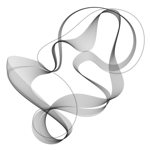
I love how these lines separate and reunite. And the fact that I can express this idea in 3 or 4 lines of code.
For me they’re lives represented by closed paths that end where they started, spending part of the journey together, separating while we go in different directions and maybe reconnecting again in the future.
The drawing is made by choosing 10 random points, drawing a curve through
those points, then slightly scooching the points and drawing another curve.
There are 40 curves, each slightly different than the last. Occasionally
the next curve makes a jump, which is why they separate and reunite.
Eventually I made something similar:
Along the way I had to learn about three techniques I got from the Kotlin
code: Hobby curves, Hilbert sorting, and simplex noise.
Each of these algorithms tries to do something “natural” automatically, so
that we can generate art that looks nice without any manual steps.
Hobby curves
To draw swoopy curves through our random points, we use an algorithm
developed by John Hobby as part of Donald Knuth’s Metafont type design system.
Jake Low has a great interactive page for playing with Hobby
curves, you should try it.
Here are three examples of Hobby curves through ten random points:
The curves are nice, but kind of a scribble, because we’re joining points
together in the order we generated them (shown by the green lines). If you
asked a person to connect random points, they wouldn’t jump back and forth
across the canvas like this. They would find a nearby point to use next,
producing a more natural tour of the set.
We’re generating everything automatically, so we can’t manually intervene
to choose a natural order for the points. Instead we use Hilbert sorting.
Hilbert sorting
The Hilbert space-filling fractal visits every square in a 2D grid.
Hilbert sorting uses a Hilbert fractal traversing
the canvas, and sorts the points by when their square is visited by the fractal.
This gives a tour of the points that corresponds more closely to what people
expect. Points that are close together in space are likely (but not guaranteed)
to be close in the ordering.
If we sort the points using Hilbert sorting, we get much nicer curves. Here
are the same points as last time:
Here are pairs of the same points, unsorted and sorted side-by-side:
If you compare closely, the points in each pair are the same, but the sorted
points are connected in a better order, producing nicer curves.
Simplex noise
Choosing random points would be easy to do with a random number generator,
but we want the points to move in interesting graceful ways. To do that, we use
simplex noise. This is a 2D function (let’s call the inputs u and v) that
produces a value from -1 to 1. The important thing is the function is
continuous: if you sample it at two (u,v) coordinates that are close together,
the results will be close together. But it’s also random: the continuous curves
you get are wavy in unpredictable ways. Think of the simplex noise function as
a smooth hilly landscape.
To get an (x,y) point for our drawing, we choose a (u,v) coordinate to
produce an x value and a completely different (u,v) coordinate for the y. To
get the next (x,y) point, we keep the u values the same and change the v values by
just a tiny bit. That makes the (x,y) points move smoothly but interestingly.
Here are the trails of four points taking 50 steps using this scheme:
If we use seven points taking five steps, and draw curves through the seven
points at each step, we get examples like this:
I’ve left the points visible, and given them large steps so the lines are
very widely spaced to show the motion. Taking out the points and drawing more
lines with smaller steps gives us this:
With 40 lines drawn wider with some transparency, we start to see the smoky
fluidity:
Jumps
In his Mastodon post, aBe commented on the separating of the lines as one of
the things he liked about this. But why do they do that? If we are moving the
points in small increments, why do the curves sometimes make large jumps?
The first reason is because of Hobby curves. They do a great job drawing a
curve through a set of points as a person might. But a downside of the
algorithm is sometimes changing a point a small amount makes the entire curve
take a different route. If you play around with the interactive examples on
Jake Low’s page you will see the curve can unexpectedly
take a different shape.
As we inch our points along, sometimes the Hobby curve jumps.
The second reason is due to Hilbert sorting. Each of our lines is sorted
independently of how the previous line was sorted. If a point’s small motion
moves it into a different grid square, it can change the sorting order, which
changes the Hobby curve even more.
If we sort the first line, and then keep that order of points for all the
lines, the result has fewer jumps, but the Hobby curves still act
unpredictably:
Colophon
This was all done with Python, using other people’s implementations of the
hard parts:
hobby.py,
hilbertcurve, and
super-simplex. My code
is on GitHub
(nedbat/fluidity), but it’s a
mess. Think of it as a woodworking studio with half-finished pieces and wood
chips strewn everywhere.
A lot of the learning and experimentation was in
my Jupyter
notebook. Part of the process for work like this is playing around with
different values of tweakable parameters and seeds for the random numbers to get
the effect you want, either artistic or pedagogical. The notebook shows some of
the thumbnail galleries I used to pick the examples to show.
I went on to play with animations, which led to other learnings, but those
will have to wait for another blog post.
These remind me of protein structures … so I downloaded the repo
and successfully replicated some of your output images in this blog entry.
Bioinformatics was my introduction to Python in 2010 on a high-school teacher’s research project (7 weeks), specifically using machine learning to differentiate mRNA from ncRNA. mRNA before it was a known term in the general population!
[1] I am on an Apple, but I did not need line 2 in requirements.txt
1 # On mac will also need:
2 # brew install cmake pkgconf cairo
[2] Why jupertlab in requirements.txt?
[3] Variable W is unused in the last 2 code cells in play.ipynb
size parameter always produces a square image qXq, where q is min(width, height)
within a size=(width,height) window panel.
Do these shapes have to be square?
Sometimes the drawings (type drawing._CairoSvg from f.draw()) are clipped. The size parameter does not affect the image; it only affects the image size.
Ed Bujak
“Ed from Philly” :) in the Boston Python Lunch Hour Zoom sessions
Ed, glad you tried the code. As I mentioned, the code is a mess, the goal was the set of drawings it produced.
As far has the shapes: no, they don’t have to be square, we could easily make a rectangle and choose points within that range to produce different drawings.


Comments
These remind me of protein structures … so I downloaded the repo and successfully replicated some of your output images in this blog entry.
Bioinformatics was my introduction to Python in 2010 on a high-school teacher’s research project (7 weeks), specifically using machine learning to differentiate mRNA from ncRNA. mRNA before it was a known term in the general population!
[1] I am on an Apple, but I did not need line 2 in requirements.txt
1 # On mac will also need:
2 # brew install cmake pkgconf cairo
[2] Why
jupertlabin requirements.txt?[3] Variable
Wis unused in the last 2 code cells in play.ipynb[4]
sizeparameter always produces a square image qXq, where q is min(width, height) within a size=(width,height) window panel.Do these shapes have to be square?
Sometimes the drawings (type drawing._CairoSvg from f.draw()) are clipped. The size parameter does not affect the image; it only affects the image size.
Ed Bujak
“Ed from Philly” :) in the Boston Python Lunch Hour Zoom sessions
Ed, glad you tried the code. As I mentioned, the code is a mess, the goal was the set of drawings it produced.
As far has the shapes: no, they don’t have to be square, we could easily make a rectangle and choose points within that range to produce different drawings.
Add a comment: