Tuesday 5 January 2010 — This is over 16 years old. Be careful.
Anne Leeds is a friend of mine from my years at Farm & Wilderness camps. We recently re-connected after 30 years (thank you, internet!) I remembered her as an energetic girl with an interest in graphic design, and was pleased to see that her essence had not changed over the years.
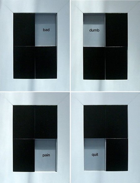
We caught up, and it turns out that she also has a child with a disability, in her case, dyslexia. One of the things she did about it was to create a dyslexia puzzle:
She describes it like this:
This is four views of a sculpture titled, “Dyslexia,” in its various positions. It’s set up like one of those picture puzzles that’s missing a piece and you slide the individual pieces around to unscramble the image. The white box represents a page. The black puzzle pieces are the letter forms “b,” “d,” “p,” and “q,” which are all the same shape flopped in different directions, thereby emphasizing the difficulty some people with dyslexia suffer in discerning letter forms. The gray areas, each revealing a new word, show how my son felt about himself during his early school years when he was diagnosed with dyslexia. The idea, as you move the puzzle pieces around, is to replicate an early reading experience, “b is for bad, d is for dumb, p is for pain, q is for quit,” and to suggest what a puzzle the experience of learning to live with dyslexia has been.
I love this: it’s typographic, it’s empathic, it’s for kids, it’s creative, it’s dealing with a disability. It’s got everything.

Comments
Add a comment: